Forms
最終更新:
tmtbnc
-
view
Default styles
<div class="span12">
<form>
<fieldset>
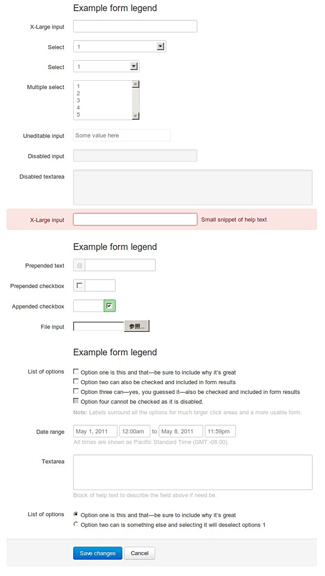
<legend>Example form legend</legend>
<div class="clearfix">
<label for="xlInput">X-Large input</label>
<div class="input">
<input class="xlarge" id="xlInput" name="xlInput" size="30" type="text" />
</div>
</div><!-- /clearfix -->
<div class="clearfix">
<label for="normalSelect">Select</label>
<div class="input">
<select name="normalSelect" id="normalSelect">
<option>1</option>
<option>2</option>
<option>3</option>
<option>4</option>
<option>5</option>
</select>
</div>
</div><!-- /clearfix -->
<div class="clearfix">
<label for="mediumSelect">Select</label>
<div class="input">
<select class="medium" name="mediumSelect" id="mediumSelect">
<option>1</option>
<option>2</option>
<option>3</option>
<option>4</option>
<option>5</option>
</select>
</div>
</div><!-- /clearfix -->
<div class="clearfix">
<label for="multiSelect">Multiple select</label>
<div class="input">
<select class="medium" multiple="multiple" name="multiSelect" id="multiSelect">
<option>1</option>
<option>2</option>
<option>3</option>
<option>4</option>
<option>5</option>
</select>
</div>
</div><!-- /clearfix -->
<div class="clearfix">
<label>Uneditable input</label>
<div class="input">
<span class="uneditable-input">Some value here</span>
</div>
</div><!-- /clearfix -->
<div class="clearfix">
<label for="disabledInput">Disabled input</label>
<div class="input">
<input class="xlarge disabled" id="disabledInput" name="disabledInput" size="30" type="text" placeholder="Disabled input here… carry on." disabled />
</div>
</div><!-- /clearfix -->
<div class="clearfix">
<label for="disabledInput">Disabled textarea</label>
<div class="input">
<textarea class="xxlarge" name="textarea" id="textarea" rows="3" disabled></textarea>
</div>
</div><!-- /clearfix -->
<div class="clearfix error">
<label for="xlInput2">X-Large input</label>
<div class="input">
<input class="xlarge error" id="xlInput2" name="xlInput2" size="30" type="text" />
<span class="help-inline">Small snippet of help text</span>
</div>
</div><!-- /clearfix -->
</fieldset>
<fieldset>
<legend>Example form legend</legend>
<div class="clearfix">
<label for="prependedInput">Prepended text</label>
<div class="input">
<div class="input-prepend">
<span class="add-on">@</span>
<input class="medium" id="prependedInput" name="prependedInput" size="16" type="text" />
</div>
</div>
</div><!-- /clearfix -->
<div class="clearfix">
<label for="prependedInput2">Prepended checkbox</label>
<div class="input">
<div class="input-prepend">
<label class="add-on"><input type="checkbox" name="" id="" value="" /></label>
<input class="mini" id="prependedInput2" name="prependedInput2" size="16" type="text" />
</div>
</div>
</div><!-- /clearfix -->
<div class="clearfix">
<label for="appendedInput">Appended checkbox</label>
<div class="input">
<div class="input-append">
<input class="mini" id="appendedInput" name="appendedInput" size="16" type="text" />
<label class="add-on active"><input type="checkbox" name="" id="" value="" checked="checked" /></label>
</div>
</div>
</div><!-- /clearfix -->
<div class="clearfix">
<label for="fileInput">File input</label>
<div class="input">
<input class="input-file" id="fileInput" name="fileInput" type="file" />
</div>
</div><!-- /clearfix -->
</fieldset>
<fieldset>
<legend>Example form legend</legend>
<div class="clearfix">
<label id="optionsCheckboxes">List of options</label>
<div class="input">
<ul class="inputs-list">
<li>
<label>
<input type="checkbox" name="optionsCheckboxes" value="option1" />
<span>Option one is this and that&mdash;be sure to include why it’s great</span>
</label>
</li>
<li>
<label>
<input type="checkbox" name="optionsCheckboxes" value="option2" />
<span>Option two can also be checked and included in form results</span>
</label>
</li>
<li>
<label>
<input type="checkbox" name="optionsCheckboxes" value="option2" />
<span>Option three can&mdash;yes, you guessed it&mdash;also be checked and included in form results</span>
</label>
</li>
<li>
<label class="disabled">
<input type="checkbox" name="optionsCheckboxes" value="option2" disabled />
<span>Option four cannot be checked as it is disabled.</span>
</label>
</li>
</ul>
<span class="help-block">
<strong>Note:</strong> Labels surround all the options for much larger click areas and a more usable form.
</span>
</div>
</div><!-- /clearfix -->
<div class="clearfix">
<label>Date range</label>
<div class="input">
<div class="inline-inputs">
<input class="small" type="text" value="May 1, 2011" />
<input class="mini" type="text" value="12:00am" />
to
<input class="small" type="text" value="May 8, 2011" />
<input class="mini" type="text" value="11:59pm" />
<span class="help-inline">All times are shown as Pacific Standard Time (GMT -08:00).</span>
</div>
</div>
</div><!-- /clearfix -->
<div class="clearfix">
<label for="textarea">Textarea</label>
<div class="input">
<textarea class="xxlarge" id="textarea2" name="textarea2" rows="3"></textarea>
<span class="help-block">
Block of help text to describe the field above if need be.
</span>
</div>
</div><!-- /clearfix -->
<div class="clearfix">
<label id="optionsRadio">List of options</label>
<div class="input">
<ul class="inputs-list">
<li>
<label>
<input type="radio" checked name="optionsRadios" value="option1" />
<span>Option one is this and that&mdash;be sure to include why it’s great</span>
</label>
</li>
<li>
<label>
<input type="radio" name="optionsRadios" value="option2" />
<span>Option two can is something else and selecting it will deselect options 1</span>
</label>
</li>
</ul>
</div>
</div><!-- /clearfix -->
<div class="actions">
<input type="submit" class="btn primary" value="Save changes">&nbsp;<button type="reset" class="btn">Cancel</button>
</div>
</fieldset>
</form>
</div>
Stacked forms
<div class="span12">
<form action="" class="form-stacked">
<fieldset>
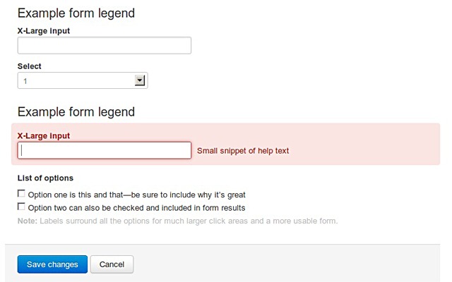
<legend>Example form legend</legend>
<div class="clearfix">
<label for="xlInput3">X-Large input</label>
<div class="input">
<input class="xlarge" id="xlInput3" name="xlInput3" size="30" type="text" />
</div>
</div><!-- /clearfix -->
<div class="clearfix">
<label for="stackedSelect">Select</label>
<div class="input">
<select name="stackedSelect" id="stackedSelect">
<option>1</option>
<option>2</option>
<option>3</option>
<option>4</option>
<option>5</option>
</select>
</div>
</div><!-- /clearfix -->
</fieldset>
<fieldset>
<legend>Example form legend</legend>
<div class="clearfix error">
<label for="xlInput4">X-Large input</label>
<div class="input">
<input class="xlarge error" id="xlInput4" name="xlInput4" size="30" type="text" />
<span class="help-inline">Small snippet of help text</span>
</div>
</div><!-- /clearfix -->
<div class="clearfix">
<label id="optionsCheckboxes">List of options</label>
<div class="input">
<ul class="inputs-list">
<li>
<label>
<input type="checkbox" name="optionsCheckboxes" value="option1" />
<span>Option one is this and that&mdash;be sure to include why it’s great</span>
</label>
</li>
<li>
<label>
<input type="checkbox" name="optionsCheckboxes" value="option2" />
<span>Option two can also be checked and included in form results</span>
</label>
</li>
</ul>
<span class="help-block">
<strong>Note:</strong> Labels surround all the options for much larger click areas and a more usable form.
</span>
</div>
</div><!-- /clearfix -->
</fieldset>
<div class="actions">
<button type="submit" class="btn primary">Save changes</button>&nbsp;<button type="reset" class="btn">Cancel</button>
</div>
</form>
</div>
Example buttons
<div class="span12">
<h3>Example buttons</h3>
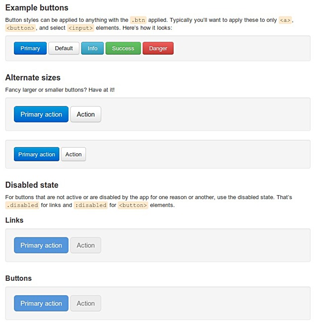
<p>Button styles can be applied to anything with the <code>.btn</code> applied. Typically you’ll want to apply these to only <code>&lt;a&gt;</code>, <code>&lt;button&gt;</code>, and select <code>&lt;input&gt;</code> elements. Here’s how it looks:</p>
<div class="well" style="padding: 14px 19px;">
<button class="btn primary">Primary</button>&nbsp;<button class="btn">Default</button>&nbsp;<button class="btn info">Info</button>&nbsp;<button class="btn success">Success</button>&nbsp;<button class="btn danger">Danger</button>
</div>
<h3>Alternate sizes</h3>
<p>Fancy larger or smaller buttons? Have at it!</p>
<div class="well">
<a href="#" class="btn large primary">Primary action</a>
<a href="#" class="btn large">Action</a>
</div>
<div class="well" style="padding: 16px 19px;">
<a href="#" class="btn small primary">Primary action</a>
<a href="#" class="btn small">Action</a>
</div>
<h3>Disabled state</h3>
<p>For buttons that are not active or are disabled by the app for one reason or another, use the disabled state. That’s <code>.disabled</code> for links and <code>:disabled</code> for <code>&lt;button&gt;</code> elements.</p>
<h4>Links</h4>
<div class="well">
<a href="#" class="btn large primary disabled">Primary action</a>
<a href="#" class="btn large disabled">Action</a>
</div>
<h4>Buttons</h4>
<div class="well">
<button class="btn large primary disabled" disabled="disabled">Primary action</button>&nbsp;<button class="btn large" disabled>Action</button>
</div>
</div>